When it comes to creating a successful hospitality business, the power of colour cannot be underestimated. The right colour palette can set the tone for your business, evoke emotions, and create a welcoming and memorable experience for your customers. As one of Sydney’s most trusted purveyors of hospitality furniture, we understand the importance of creating a cohesive colour environment within a business. That’s why we’re exploring the impact of colour on your customers and the success of your establishment and providing you with a step-by-step guide to choosing the perfect colour palette for your space.
The Impact of Colour
Colour is more than just a visual element—it’s a powerful tool that can influence emotions, behaviour, and perception. When used strategically, the right colour palette can:
- Create an Atmosphere: Different colours convey different moods. For example, warm colours like red and orange can make a space feel energetic and lively, while cool colours like blue and green can create a more relaxed and tranquil environment. Colour has the power to define the atmosphere of your restaurant or bar.
- Affect Appetite: Colour can impact your customers’ appetite. Warm, inviting colours like red and yellow are often associated with increased appetite and can be perfect for restaurants. On the other hand, cool and calming colours like blue can be more suitable for a bar or lounge where customers may want to relax and socialize.
- Improve Branding: Consistent use of colour in your branding can help customers remember your business more easily. When you choose a colour palette that aligns with your brand’s values and message, it creates a cohesive and memorable image for your establishment.
Choosing the Right Colour Palette
Step 1: Define Your Brand
Before you start selecting colours, it’s important to understand your brand’s identity and message. What values do you want to convey to your customers? What emotions do you want to evoke? Your brand’s mission, vision, and personality will guide your colour choices.
Step 2: Consider Your Target Audience
Think about your target customers. Who are they, and what are their preferences? Are you catering to a young and trendy crowd, families, or a more mature clientele? Your colour palette should resonate with your target audience.
Step 3: Analyze Your Space
The size and layout of your establishment can also influence your colour choices. Dark colours can make a small space feel cosier, while light colours can open up a room. Consider the natural lighting, ceiling height, and architectural elements of your space.
Step 4: Complementary and Contrasting Colours
Consider the principles of colour theory. Complementary colours, those opposite each other on the colour wheel (e.g., red and green), can create a vibrant contrast. Analogous colours, adjacent on the wheel (e.g., blue and green), offer a harmonious and calming effect. Experiment with combinations that suit your establishment.
Step 5: Test and Adapt
Once you’ve chosen your colour palette, don’t forget to test it in your space. Paint swatches on your walls or use temporary decorations to get a feel for how the colours work in your setting. You can also seek feedback from friends, family, or even potential customers to ensure your choices resonate.
Colour Palette Examples
To provide some inspiration, here are a few colour palettes that work well with varying hospitality styles:
- Classic Elegance
Main Colours: Deep burgundy, rich gold, and classic black.
Style: Perfect for upscale restaurants, this palette exudes sophistication and luxury.
- Coastal Retreat
Main Colours: Soft aqua, sandy beige, and seafoam green.
Style: Ideal for beachfront bars, it creates a relaxed and tranquil beach atmosphere.
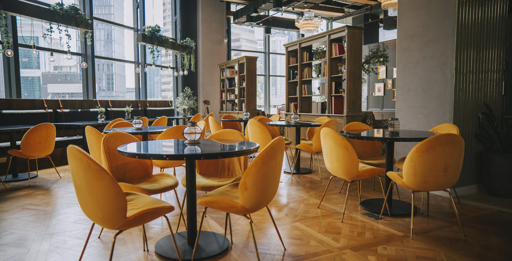
- Bohemian Vibes
Main Colours: Earthy terracotta, warm mustard, and deep teal.
Style: Suited for trendy cafes, this palette brings a bohemian and eclectic touch.
- Modern Minimalism
Main Colours: Cool grey, crisp white, and accents of matte black.
Style: Ideal for contemporary coffee shops, it represents simplicity and clean lines.
Farm-to-Table Freshness
Main Colours: Fresh green, rustic brown, and creamy white.
Style: Perfect for farm-to-table restaurants, it evokes a sense of freshness and natural ingredients.
Remember, the right colour palette can set the stage for your establishment’s success. By following these steps and carefully selecting your colours, you can create a captivating and inviting space that resonates with your customers and leaves a lasting impression.
At Have a Seat, we offer a wide range of commercial furniture options to complement your chosen colour palette and style. Stop by our Smithfield showroom or visit our online store. Our expert team would love to help you bring your vision to life. Happy decorating!